MiroMedic logotype
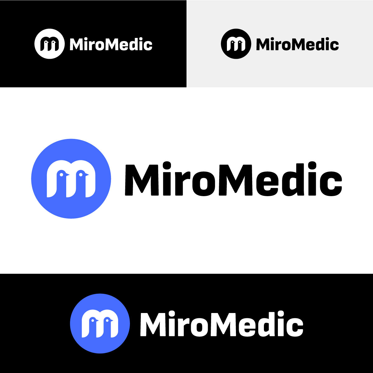
The MiroMedic logo is the core representation of our brand, symbolizing trust, calm, professionalism, and clarity. The main version uses MiroMedic Blue (#456DFF) for the symbol, with black (#000000) or white (#ffffff) text depending on the background.

MiroMedic light & dark logo
Logo on dark
Logo on light
When placed on a black or dark background, the logo features the MiroMedic Blue symbol with white text. If this isn’t suitable, the all-white version of the logo is used.
For light backgrounds, we consistently use the primary logo with the MiroMedic Blue symbol and black text. When this isn’t possible, such as in print, we opt for the black version of the logo.

MiroMedic logo versions
Secondary logo
MiroMedic logo with slogan
This is our secondary logo, used only when the primary logo doesn’t fit the layout.
The logo with the slogan is reserved for large formats to ensure readability. It’s available in multiple languages for localized markets.

MiroMedic logo symbol
This is the MiroMedic logo symbol. For smaller formats, it can be used independently without typography—such as in app icons or website favicons.
There are two versions of the symbol: MiroMedic Blue and white. The primary version is MiroMedic Blue, while the white version is reserved for use on MiroMedic Blue backgrounds.

Clear Space & Minimum Dimensions
To maintain the logo’s strength and integrity, a clear space must surround it, free of any visual interference. For legibility in print and digital formats, the logo should not be displayed smaller than its recommended minimum size.

Clear space requirements for the primary logo version.
The minimum width for the primary logo version must be at least 80px or 17mm.

Clear space requirements for the secondary logo version.
The minimum width for the secondary logo version should be no less than 55px or 11mm.

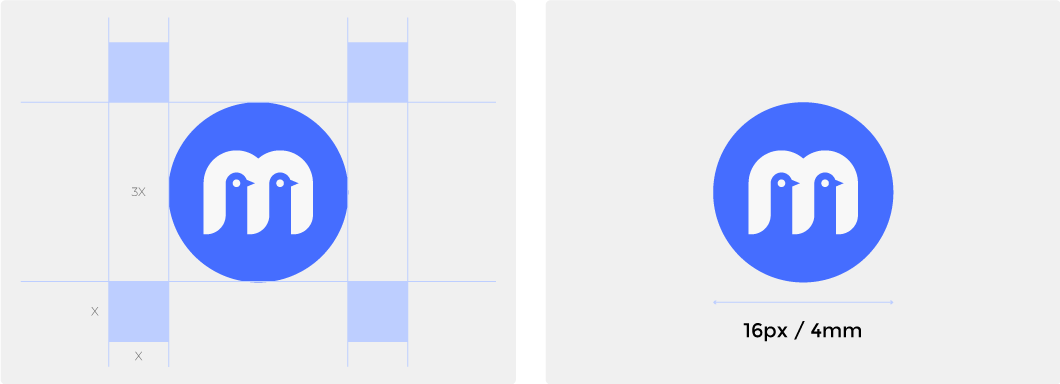
Clear space requirements for the logo symbol.
The minimum width for the logo symbol should be at least 16px or 4mm.
What we do and do not with MiroMedic logo

We consistently apply the logo in the designated brand colors.
The logo must remain in its original colors and should not be altered or recolored.

We only use black or white for text.
We do not use MiroMedic Blue or any other color for the logo text.

We ensure the logo has accurate proportions and composition.
We maintain the original proportions of the logo.

We leave the logo some space to breathe.
We do not extend the logo beyond its safety zone or reduce it to below its minimum size.

We ensure that the logo has sufficient contrast against the background.
We avoid placing the logo over any image or background that could hinder its visibility or readability.

We use a 0-degree angle.
We do not rotate the logo.

We ensure the logo is designed with proper proportions and composition.
We do not alter the arrangement of the logo elements.

We maintain the proper proportions and composition of the logo.
We avoid using any effects.

We ensure that the slogan remains legible in its intended usage context.
We avoid using the logo version with the slogan at a small scale.


